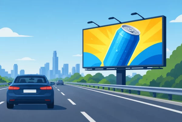

A driver on I-4, US 27, or a busy Orlando surface street does not stop to study an ad. They see it for a few seconds while managing traffic, signs, weather, and everything else on the road. That is why learning how to design readable billboards is not simply a creative exercise. It is how you turn a high-visibility location into a message people can actually absorb and remember.
The strongest billboard creative makes one idea feel immediate. It gives people a brand, a benefit, and a reason to act without asking them to work for it. For businesses competing across Central Florida, that clarity can make the difference between a campaign that blends into the drive and one that stays top of mind.
Start With One Message, Not a Mini Brochure
A billboard has a job: make a memorable impression fast. Trying to promote every service, product feature, location, discount, and social media handle at once weakens that job.
Choose the single message that matters most to the audience passing that specific location. A local injury law firm may lead with a clear need-state such as “Hurt? Call Today.” A restaurant near a high-traffic retail corridor may focus on a craveable product and a nearby location. A home services company may put its core category and a simple promise front and center.
Think of the creative as an outdoor headline, not a webpage. If the audience cannot repeat the main point after one pass, the message is carrying too much.
This does not mean every billboard needs only a few words. The right amount of copy depends on speed, viewing distance, traffic flow, and whether the board is static or digital. But brevity is almost always an advantage. Give each word a clear role. If removing it does not reduce understanding, remove it.
How to Design Readable Billboards for Moving Audiences
Readability starts before the design team chooses a font or opens a layout file. It starts with the road.
A freeway-facing board needs to communicate more quickly than a display positioned near slower traffic, an intersection, or an entrance to a shopping district. Drivers on fast-moving routes have less time to process small details. Traffic that regularly slows can support slightly more information, but clear hierarchy still wins.
The billboard’s orientation matters too. A design viewed from a long approach needs large elements that register at distance. A location with a short viewing window needs a message that makes sense instantly. Digital billboards introduce another variable: the message must work within a limited display rotation, without relying on a viewer seeing the prior or next ad.
Before approving creative, ask a practical question: what should a driver understand in three to five seconds? The answer should be obvious in the final layout.
Build a Clear Visual Hierarchy
Every readable billboard should establish an order for the eye. In most cases, viewers should see the brand or product first, the primary benefit second, and the call to action or contact detail last.
Make the headline the largest element. It should dominate the composition rather than compete with the logo, photography, background pattern, and offer. A brand with strong recognition may let its logo do more work. A newer business may need the category or benefit to lead, with the logo positioned clearly beside or beneath it.
Avoid treating every line as equally important. When everything is large, bold, colorful, or outlined, nothing stands out. White space is not unused space. It is what gives the message room to be seen.
Use Type That Reads From a Distance
Stylized lettering can look distinctive on a screen and become difficult to read from the road. Choose typefaces with clean letterforms, strong spacing, and enough weight to hold up at large scale. Simple sans serif fonts often perform well because their shapes remain clear at a glance.
Script fonts, narrow condensed styles, thin weights, and decorative effects deserve extra caution. They can work in a logo or a short accent, but they should not carry the campaign’s essential message. The same goes for all-capital text used in long phrases. It can feel powerful in a short headline but becomes harder to scan when overused.
Size matters, but contrast and spacing matter just as much. Give letters room to breathe. Tight tracking, crowded lines, and text placed over busy imagery make even large copy harder to read.
Create Contrast That Works in Real Conditions
High contrast is one of the fastest ways to improve billboard readability. Dark text on a light, clean background or light text on a dark background gives the eye a clear signal. Low-contrast color combinations may suit a brand palette, but they rarely suit roadside communication.
Be cautious with combinations such as red on black, dark blue on purple, yellow on white, or midtone colors layered over photographs. They can lose definition in bright Florida sun, rain, glare, or low-light conditions. A message needs to remain legible in the real environment, not just on a designer’s monitor.
If a photo is central to the creative, use a solid color field, translucent panel, or intentionally quiet area behind the copy. Text should never fight with a face, a product texture, tree line, or detailed skyline.
Let Images Support the Message
A great billboard image is easy to identify in an instant. It might be a close-up of a menu item, a recognizable product, a human face with a strong expression, or a simple visual demonstration of the service being promoted.
Wide shots often underperform because the subject becomes too small. A restaurant billboard showing an entire dining room, for example, may feel polished but tells a driver very little at speed. A close-up of the signature dish is more immediate. Similarly, a contractor’s billboard may benefit more from a clear before-and-after visual or a confident technician than a crowded collage of completed projects.
Use one strong image whenever possible. Multiple photos, badges, icons, and product packages can quickly turn a board into visual noise. There are exceptions: a retailer running a recognizable multi-brand promotion or an event with several headline acts may need more than one visual cue. In those cases, the layout still needs one dominant focal point.
Make the Call to Action Easy to Act On
Not every billboard needs a phone number, website, QR code, address, and social handle. In fact, including all of them usually makes the ad less effective.
Choose the response method that matches campaign goals. If the goal is brand awareness, a memorable name and a focused message may be enough. If immediate response matters, use one clear action, such as a short web address, an easy phone number, or a concise instruction like “Exit 12” or “Visit Us in Davenport.”
QR codes require special judgment. They can be useful for pedestrians, passengers, or slow-moving environments, but they are not a reliable primary action for drivers. A moving audience should never need to scan a code to understand the offer. Make the billboard work first, then treat the code as an optional convenience where appropriate.
Test the Design Before It Goes Up
The most useful test is brutally simple: shrink the creative until it resembles a quick roadside glance. Can you still identify the brand, offer, and next step? If not, simplify it.
Review it on a phone from arm’s length, then step back. Ask someone unfamiliar with the campaign what they noticed first and what they think the ad is selling. If their answer is uncertain, the problem is usually hierarchy, copy volume, or contrast, not a lack of visual effects.
It also helps to review the artwork with the actual billboard dimensions and location in mind. A layout that feels balanced on a standard horizontal presentation may need adjustment for a tall or unusually shaped display. Production requirements, viewing angles, and the surrounding environment can all affect how the finished board performs.
This is where an experienced outdoor partner adds value. Orlando Outdoor can align creative with the location, audience, production specifications, and campaign objective so the design does more than look good in a proof. It performs where it counts: on the road.
Keep the Campaign Consistent
A single billboard can build awareness. Repeated, consistent creative builds recall. When a campaign runs across Orlando, Lakeland, Winter Haven, Ocala, Davenport, or Sebring, keep the primary brand elements and message structure familiar from board to board.
You can tailor an offer or location reference by market without reinventing the design every time. Consistency helps commuters connect each impression to the same business, especially when outdoor advertising is working alongside paid search, social media, radio, direct mail, or local events.
The goal is not to make every board identical. The goal is to make every board instantly recognizable as yours. A clear headline style, repeatable color treatment, recognizable product image, and disciplined logo placement can create that recognition quickly.
A readable billboard respects the audience’s attention. Give drivers one clear thing to see, one clear thing to remember, and a design strong enough to carry your brand through the noise of the daily drive.